
Brand Identity design for Timeless fashion label jacynth London
Jacynth London is fashion boutique The Bias Cut’s own brand fashion label. It is timeless, sophisticated, but with a playful twist - a wink, a sparkle in the eye.
Taking inspiration from the women of Hollywood’s golden era and with The Bias Cut’s core customer at heart, the branding for Jacynth London reflects the strength, personality and multi-faceted nature of The Bias Cut woman.
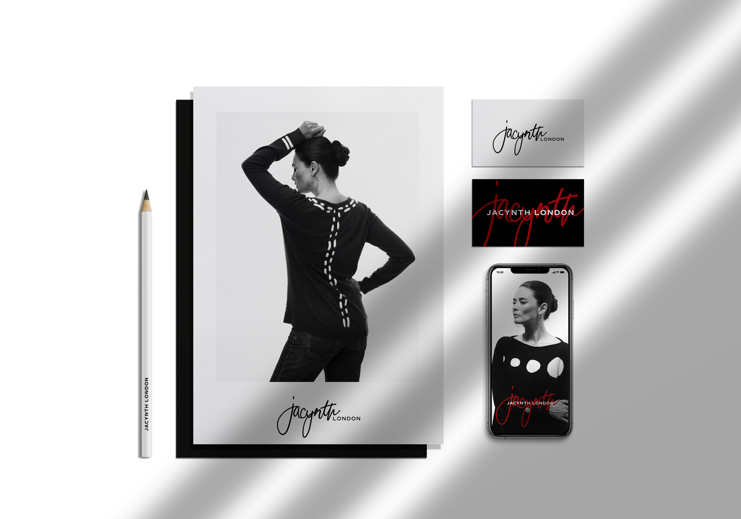
The logo is based on the founder, Jacynth Bassett’s signature. The colour palette is monochrome with a pop of red, just like like that red lip that pulls an outfit together and gives it a new layer of sophistication.
The brand is refined and elegant, but highly personal too - to both the founder, Jacynth, and to the core customer. Which is why the handwritten elements, including the signature logo, doodles and handwritten notes on imagery, are all key to the brand’s personality.
Light Sauce Studio designed the brand strategy, brand identity and assets including motion graphics for the label, as well as advising on visual direction.


